
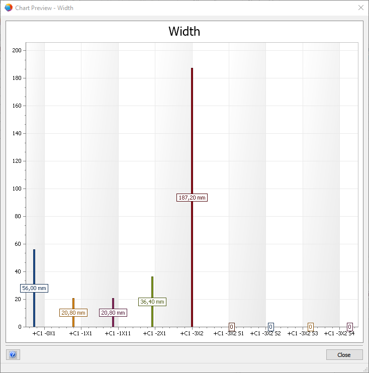
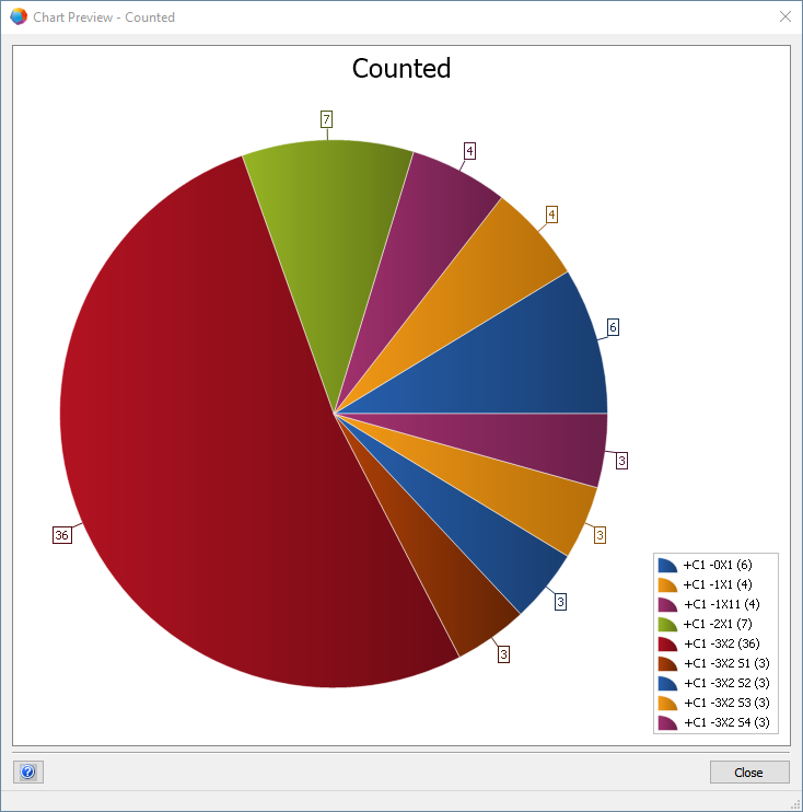
Lists and worksheets are an essential tool and an important source of information for engineering experts. However, endless lines of text and/or numbers are often very difficult to grasp and interpret. Thus, EB's version 2020 R2 now offers a completely new overview for worksheets: by simply clicking on an icon, you can visualize selected table information – one chart says more than 1,000 lines of data.
You can choose whether to display the data in a bar or pie chart, etc. If you simply select the desired (countable) columns, you can see at a glance, for example, the different widths of all terminals on a particular block and how many of them are installed. Alternatively, you can view the device types planned in a plant and their percentages, the number of process steps assigned per supplier, the time scheduled per supplier or whatever is of interest to you.
Workflow results at a glance
Charts can also be used in conjunction with the Workflow Assistant to check the statuses set there or to display their status clearly. This enables a project manager to immediately see how many statuses have already been completed or are still in progress or in planning. To do so, he doesn't have to laboriously battle through a confusing jungle of data and documents, but finds all relevant and up-to-date information exceptionally quickly via EB's central data model, without system hopping or tinkering around with Excel.
Web service: overview from anywhere
The clear diagrams at the touch of a button and the easy access to them greatly facilitate an overview. Thus, the charts are a real hit especially for project managers and other responsible persons. All data for overviews and charts can be accessed via a web service, i.e. at any time from anywhere, without the EB client having to be started anywhere.